
The Vancouver Canucks certainly have colourful jersey history, having gone through a palette rivalling that of a rainbow. From the stick-in-rink to crashing orca, the team has struggled to establish a stable identity throughout its four decades in the league.
Special thanks to nhluniforms, nhlpatches and SportsLogos for being incredible resources from which much of the information and illustrations were drawn.
With a new brand and stellar play on the ice, however, the NHL’s westernmost team is beginning to make its mark in a sport which values tradition and culture above all else.
Contents
Humble Beginnings
After denying the city in 1967, the league finally (under threat of lawsuit) awarded Vancouver an NHL expansion franchise for the 1970-71 season.
Immediately, the Canucks drew inspiration from the beautiful BC outdoors and chose two unmistakably Pacific Northwest colors: Royal Blue and Kelly Green. The original stick-in-rink design was designed by Joe Borovich and features a blue ice-rink intersected by a white hockey stick from the right. Cleverly, the green outline around the rink subtly forms the letter “C”. On the primarily blue road uniforms, the colors were reversed save for the green outline.
1970 – 1972

The inaugural Vancouver Canucks home jersey featured two stripes of Royal Blue and Kelly Green along the waist, cut down the middle by a thin white line. The sleeves were dipped blue at the ends, above the same two stripes with a ‘V’ stitched over them. The road jerseys were nearly identical, with the only change being the striping; Instead of one stripe of each colour, it featured two green stripes.
A wide block font was used for the jersey numbers in the first year before it was changed to the standard block font.
1972 – 1977

Two seasons after their NHL debut, the Canucks made the first change to their jerseys. In place of the previous striping was a single thick green one, flanked by two thin blue stripes on the home jersey and two thin white ones on the road.
1977 – 1978

In the 1977-78 season, the NHL began requiring teams to add names to their jerseys. The Canucks did so, with the home whites initially featuring a blue name bar due to a lack of white ones.
Aggressive Hues
During the summer of 1978, the Vancouver Canucks worked with a marketing firm called Beyl and Boyd to come up with a new look. The San Francisco-based company viewed the current colour scheme as too tranquil, recommending a change to yellow and orange.
As part of the rebranding, Beyl and Boyd chose a logo designed by Mike Bull: a diagonal skate drawn with 18 different diagonal lines and featuring the word “Canucks” below it. The logo is still referred to as the “Spaghetti Plate” and “Downhill Skate”.
1978 – 1979

The first major revision for the Canucks was a significant departure from the rest of the league. The bright-yellow home jerseys featured a large orange and black “V” (which stood for “Victory” as opposed to “Vancouver”) across the chest, as well as two smaller ones on the sleeves. The predominantly-black road jerseys were similar, except with a fiery orange replacing black. With both the pants and socks featuring the letter, there was a total of 7 throughout the entire uniform. In an unprecedented design decision, the Canucks logo was relegated to a secondary position on the sleeves.
Player names were orange, with black (yellow for the road jerseys) numbers located below it and on the bottom of the sleeves. A wide block font was used, similar to the original jerseys.
1979 – 1980

A minor change was made to the new look for its sophomore season, with horizontal stripes replacing the “V”s on the socks. The “V” count now totals 5.
1980 – 1981

Another alteration was made one year before the Canuck’s first Stanley Cup appearance: The black along the chest and sleeves were connected, forming one continuous panel.
1981 – 1982

For the 1981-82 season, the letters were recoloured black on the home jerseys, and the numbers outlined in orange on both to improve visibility.
1982 – 1985

After the Cup run of ’82, the TV numbers became thinner and were moved above the Canucks logo. The names also gained an orange outline.
During the 1984-85 season, the Vancouver Canucks wore their first patch in franchise history: a rectangle with the letters “JCM” embroidered within. The patch was a tribute to their late general manager and Senior Vice-President John C. “Jake” Milford, who passed away on December 24, 1984. The patch was placed on the left shoulder on the home jerseys and the left chest on the road.
Toning it Down
After the Vancouver Canucks’ began the Halloween Era with their wild Flying V jerseys, the team gradually returned to hockey sweater conventions throughout the next decade.
1985 – 1989

The Vancouver Canucks finished off the last half of the 80s with a more traditional sweater featuring the Skate logo previously found on the sleeves. The “V”s were not completely eliminated, however; they were relocated to the shoulder yokes.
Although the home jerseys remained bright yellow, traditional horizontal striping returned in orange and black. The black road jerseys were similar, except with the latter replaced by yellow.
Many patches appeared on this jersey despite its brief existence. During the 1985-86 season, the Canucks wore patches commemorating Vancouver’s centennial and the Expo ’86 World Fair. A year later, the team wore a patch supporting Rick Hansen’s Man in Motion Tour on their bottom-left hem. Lastly, a rectangular patch embroidered with “BABE” was worn during the 1988-89 season to honour hockey player and Canuck Goodwill Ambassador Walter “Babe” Pratt.
1989-92

The team finally removed all traces of the “V” as it rang in the new decade with updated uniforms. This revision was significantly less aggressive than the previous due to thinner striping, the removal of nonparallel lines, and a switch to white on the home jerseys.
Although this particular jersey only stuck around for three years, unique patches were worn in two of them. In the 1989-90 season, the team wore their commemorative 20th anniversary patch on their left shoulder, while the league-standard NHL 75th Anniversary patch was worn on their right chest through the 1991-92 season.
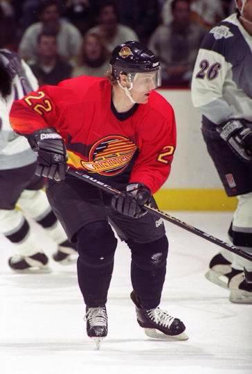
1992-97

Due to the colours no longer being manufactured, burnt orange and gold were replaced with blood red and yellow in 1992. This new colour-combination is featured in some of the most iconic Canucks moments, such as Bure’s series winning goal against the Flames in 1994, and the Linden-McLean hug after Game 6 of the same year’s Cup Finals.
With the updated jerseys also came the Canuck Place patch (representing North America’s first free-standing hospice), placed on the right shoulder. The Canucks would wear the patch during the duration of the jersey. The team also wore the Stanley Cup Centennial patch on their right chest during this season.
In the 1993-94 season, the Canucks wore the Canuck Place patch along with the “2 Pts. F.G.” patch in honour of Frank Griffiths, who passed away in the spring of 1994. The latter stayed on their right chest from the start of the playoffs until the Cup Finals, when it was moved to the left shoulder in order to accomodate the 1994 Stanley Cup Finals patch.
In the lockout-shortened 1994-95 season, the Canucks celebrated their 25th anniversary as an NHL franchise. To commemorate this milestone, the team wore a Silver Anniversary patch on their right chest.
1995-97
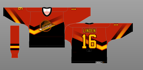
The Canucks joined the NHL’s first third jersey program for the 1995-96 season, unveiling salmon-coloured alternates. Running across the chest were two thick, gradient lines in gold and black, forming an off-centered “V”. The logo on the front remained the same downhill spaghetti plate seen in the previous few jerseys.
Both shorts and socks were black in this jersey’s first year of use. In 1996-97, however, a splash of colour was added to the latter. While the Canuck Place patch appeared on the home and away variants, no patches were worn on this jersey.
Orca Bay Takes Over
After more than a decade of halloween colours, the Canucks unveiled yet another uniform revamp for the 1997-98 season. Replacing bright yellow and red were a west coast combination of navy, silver, blue, and maroon.
The new crest was also influenced by the region, depicting an orca crashing through the water. Inspired by Haida art, it was designed by Brent Lynch who also designed logos for the Vancouver Giants and Victoria Royals.
The Canucks’ parent company, Orca Bay Sports and Entertainment, was initially reluctant to adopt the logo because of the similarities to their own brand, but changed their minds after seeing how perfectly it fit the west-coast motif.
1997-00

The first iteration of the jersey was worn during the 1997-98 season. The home jerseys were white, with four stripes on the sleeves and hem: maroon, blue, silver dazzle, and navy. The away jerseys were similar, only with the navy and blue switched.
During the 1997-98 season, the Canucks traveled to Japan to play two games against the Mighty Ducks of Anaheim. For the occasion, a GameONe ’97 patch appeared on the left shoulder. The Canucks also wore a patch on their right chest to commemorate the 1998 All-Star Game, which they hosted in the new GM Place. In 1999-00, the NHL2000 patch was worn to ring in the new millennium.
2000-03

Before the 2000-01 season, CCM moved their logo from the bottom right hem to back collar. Dark jerseys were also rebranded to KOHO, a subsidiary the company acquired in 1998. Lastly, the NHL logo was recoloured silver from the older orange.
2001-05

In 2001, a new alternate jersey was unveiled. Gradient was again used, with the torso transitioning from navy to deep red towards the bottom. This was also the first Canucks jersey with shoulder yokes, which were red with a silver dazzle outline. The lower-sleeves were also red, and angled off to form a “V”.
The Canuck Place patch returned on the right shoulder, albeit with a few changes. This version was wider and more square than the previous, with a navy background instead of black. The logo itself, however, remained identical.
2003-04

After a disappointing playoff run in which the team was ousted in the second round, the Canucks made a minor change to their jersey. Shoulder patches were added, which featured the team’s original stick-in-rink logo in the new colours.

Vancouver participated in the NHL’s Vintage program the same season, wearing throwbacks to the Canucks’ second jersey. Worn during special occasions (usually against Original 6 teams), it featured the older CCM logo placement on the bottom right hem as well as the NHL Vintage patch on the right chest.
2005-07

After a full season was lost to the lockout in 2004-05, a slight change was made to all three of the Canucks’ jerseys. Reebok, who acquired CCM in June 2004, updated all NHL jerseys with their vector logo.
The Canucks started their season on October 5, 2005, wearing the NHL Cares patch for victims of the devastating Hurricane Katrina. The team switched back to their regular game jerseys after the first period, with the patched ones being auctioned off for charity.
2006-07

The following year, Vancouver’s stick-in-rink Vintage jersey became the team’s new alternate. No changes were made to the design save for the CCM logo, which was replaced with Reebok’s vector.
In a game against the Edmonton Oilers on January 5th, 2007, the Canucks wore the Teammates for Kids patch on the right chest of this jersey. It represented the Garth Brooks’ Teammates for Kids Foundations which became the NHL and NHLPA’s official children’s charity.
These two decades saw the Canucks go through some ups and downs, from playing in the 1994 Stanley Cup Finals to the dark Messier/Keenan era that followed. Finally, Marc Crawford’s run-and-gun style met the perfectly-mismatched line of Naslund, Morrison, and Bertuzzi, propelling the team into the West Coast Express era.
:format(webp)/cdn.vox-cdn.com/uploads/chorus_image/image/5973453/naslund_bertuzzi_morrison_f.0.jpg)
During the years between 2002-2005, this maroon, silver, and blue orca saw the emergence of the Vancouver Canucks as a dominant force in the NHL.
Return to Royal Blue
After a year of Reebok-branded CCM jerseys, the NHL made the transition to the Reebok Edge uniform system for the 2007-08 season. Changes included a more tapered cut, new lightweight materials, and for most teams, a new look. Learn more about the evolution of Reebok Edge.
Blending old with the new, the Canucks retained a recoloured Orca. The team also added an arched “VANCOUVER” wordmark above it, an homage to the original WHL Canucks who wore a similar element on their jerseys. Nonetheless, this addition caused controversy among those who believed it to be a transparent attempt to capitalize on the Winter Olympics hosted by the city.
2007-11

The Canucks’ original royal blue and kelly green colour scheme was brought back, replacing navy blue, maroon, and silver. The layout was near-identical to the jerseys used from 1972-78, with the thick green waist and sleeve stripes flanked on both sides by thinner white ones on the home blue jerseys. The white away jerseys were very similar, except for a few swapped colours.
The only patch worn on this Vector-logo’d jersey was the 2011 Stanley Cup Finals patch.
2008-2017

Teams were limited to just two jerseys for the first year of Reebok’s Edge uniform system due to manufacturing restrictions. However, things improved by year two, and the Canucks took advantage by unveiling an alternate uniform. The modernized stick-in-rink logo was moved from the shoulders to become its main crest, with a Johnny Canuck-inspired patch in its previous place.
Striping was also altered on these jerseys, with the green becoming thinner and the addition of an extra pair of blue stripes.
The Canucks wore the Vancouver Millionaires ‘V’ patch during the latter part of the 2012-13 season. The team would later wear a complete replica of the Pacific Coast Hockey League team.
2010-2011

The Vancouver Canucks celebrated their 40th anniversary with retro throwbacks to their original uniform worn from 1970-72, complete with the absence of a nameplate. The jersey also featured two thick hem stripes in white and blue. The sleeves had the same, in addition to the white, overlaid “V”.
Additionally, the Canucks wore a special 40th Anniversary patch on the right chest. The genuine patch was only found on the players’ on-ice jerseys and Premiers sold through the official Team Store, so those who bought a jersey through other channels were forced to look for aftermarket replicas.
The Canucks wore this jersey on opening night against the LA Kings, who wore their own throwback jerseys for a recreation of the Vancouver team’s first-ever NHL game. Because these alternate jerseys were white, teams visiting Rogers Arena would wear their dark uniforms typically used at home.
2011-2017

A very minor change was made to NHL jerseys during the summer of 2011: the Reebok Vector logo used since the 2006-07 season was replaced by the wordmark as part of the company’s rebranding.
The Canucks wore the league-wide NHL Centennial ‘100’ patch on their right sleeve during the 2017 calendar year.
2013, 2014, 2015

The Canucks celebrated the Cup-winning Vancouver Millionaires by sporting a near-identical replica of their sweater on three occasions. The burgundy jersey featured a felt V-shaped crest with the word “VANCOUVER” written within, as well as four cream-coloured arm stripes and a bottom hem of the same colour.
In its first appearance on March 16, 2013, the team used names and numbers made of tackle twill. However, those sold on fan jerseys were felt and of a different font. As a result, it was extremely difficult to purchase one completely accurate to their on-ice counterpart.
The Millionaires jersey was worn again for during the 2014 Heritage Classic, this time with felt names and numbers as well as an updated NHL shield. Although the BC Place roof was closed, the burgundy paired with Ottawa’s own vintage design was a sight to behold. The team also wore its Heritage Classic patch for the game, which was moved to the chest from its original location on the shoulder.
The final time these jerseys were used was to commemorate the 100th anniversary of the Millionaires’ Cup win. The felt lettering kit from the Heritage Classic was used, although with the older NHL shield.
2016

The final Reebok specialty jersey was worn to celebrate the 20th anniversary of Rogers Arena (then known as GM Place). On February 14, 2016, the Canucks hosted Retro Night against the Toronto Maple Leafs in a recreation of the 1994 Playoffs.
Striping and colours were identical to those worn from 1992-97. However, the Canucks did not sport the Canuck Place patch, which was a significant missed opportunity to support the hospice.
On to Adizero
In 2017, the NHL transitioned to the Adidas’ Adizero system, which featured Climalite technology engineered to be lighter, stronger, and more durable than its predecessor. The jerseys also had a different cut, new collar design, updated NHL shield, and more. For a comprehensive comparison, visit my breakdown of the Canucks’ Adizero jerseys.
2017-2019

While some teams in the league took the opportunity to update their uniforms, the Canucks’ look remained mostly identical except for the Adidas-styled collar and dotted shoulders. Additionally, the shoulder patches became jacquered to increase flexibility.
The Centennial ‘100’ patch carried over and stayed on its right sleeve for the rest of 2017. Vancouver also wore the NHL China Games patch during the two matches played in Shanghai and Beijing against the LA Kings.
Golden Jubilee & Beyond (2019- )
Two years after adapting their longstanding design to the Adizero template, the Vancouver Canucks were finally ready to make a change to celebrate a half century in the NHL. In addition to the customary retro jersey, the team unveiled a new heritage jersey, along with an updated home and away set.
2019-

In keeping with the organization’s desire to retain the current colours, modifications to its home and away jerseys were minor.
Certainly a design evolution rather than overhaul, the most drastic change was the removal of its wordmark that previously lived above the crest. The exclusion serves to simplify the jersey and allow for more focus to be placed upon the enlarged Orca’s “C” shape.
Another change was the modified secondary logo on its shoulders, which were recoloured to be primarily white on both the home and away jerseys. This colour adjustment served to further accentuates the “C” in its design, and gave it a retro look. It is a similar design to the crest of the Canucks Team Classic sweater.
As part of the team’s golden celebrations, a 50th Anniversary patch appeared on the jersey’s right chest.
In 2021, the Canucks–along with the rest of the league–switched to Adidas’ new PRIMEGREEN jerseys, made of a minimum 50% recycled content. In addition to the new composition, these jerseys also featured “Dimensional Embroidery” on its crests, which consisted of thicker, and additional embroidery detail to accentuate shadows and highlights, resulting in a faux-3D look. Read SportsLogos.net’s deep dive into the differences.
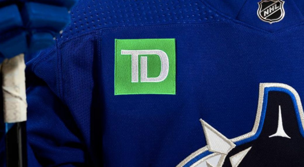
Just prior to home opener of the 2022-23 season, the Canucks organization announced their first jersey sponsor: TD Bank. Their logo will be worn on the right shoulder of their jerseys for the duration of the season.
2019-2022

The aforementioned secondary logo then became the centerpiece of the team’s heritage jersey, which also draws influence from Vancouver’s inaugural set. A pair of thick, green stripes on the sleeves and hem frame the logo, as does a solid white collar. To add a local touch, the crested numbers were perforated in a pattern which represents the west coast rain.
Like the home/away set, the 50th Anniversary logo is present on the right chest.
Click here for a more in-depth look into the Canucks’ Heritage jersey.
Update: Per a Canucks spokesperson speaking with Vancouver publication Daily Hive, the heritage jerseys has been retired as of the 2022-23 season.
2019-2020

In August 2018, the Vancouver Canucks held a fan poll to determine the throwback sweater to be worn three times during team’s golden anniversary.
By its conclusion, the ever-popular Skate had captured over 65% of votes over the Flying V and original Orca designs.
The popularity should come as no surprise, as the Canucks iced the jersey to much fanfare in 2016 as part of the Rogers Arena anniversary celebrations.
With the Adizero iteration, Vancouver retained what is essentially the identical design. The most noticeable departure, however, is the yellow and red Adidas-style collar, while the black area above the “S” is a subtler change. This design also adds a recoloured 50th Anniversary logo on it’s right chest.
2020 – 21

The Canucks unveiled a familiar uniform as part of Adidas’ league-wide Reverse Retro program, which sought to reimagine fan favourite jerseys of the past using current colours.
Based on the team’s gradient alternate uniforms used from 2001-07, the V-shaped shoulder yokes and sleeve trim return. However, the salmon red is swapped for kelly green, framing Vancouver’s current current navy, silver and white crest. An absolute beauty, if not slightly derivative of a certain soft drink.
2022 – 2023

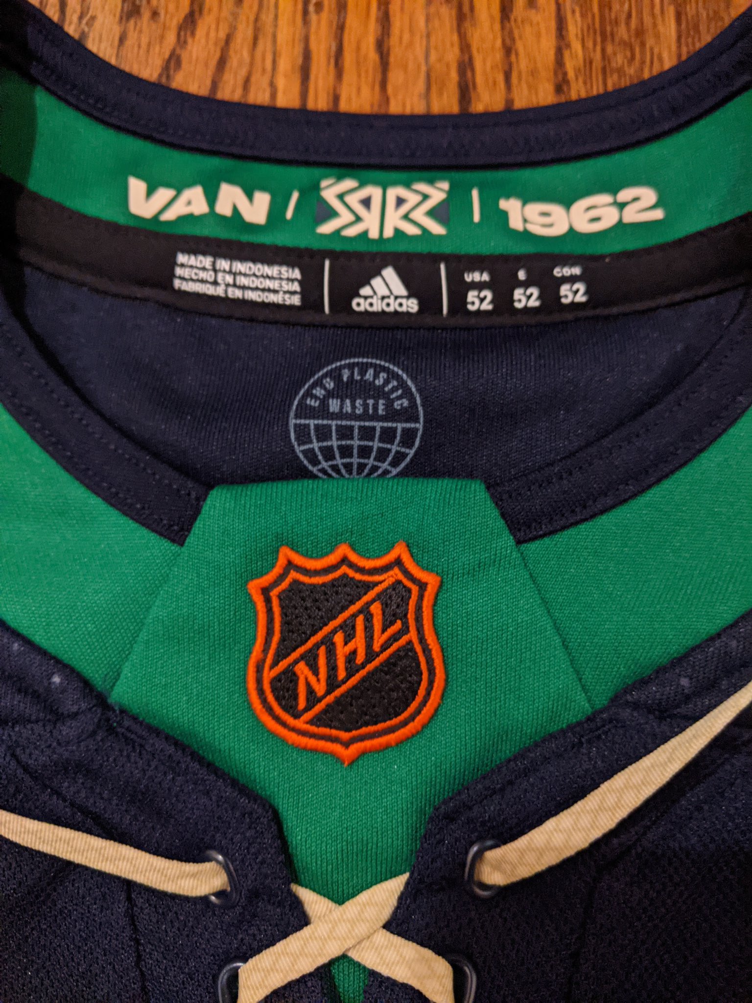
With the second iteration of the NHL’s Reverse Retro program launching in 2022, the Canucks took the opportunity to celebrate another part of their rich history with a throwback based on the 1962 WHL Vancouver Canucks.
The uniforms are almost identical to its inspiration, with exception of the modern colour scheme. Overlaid on a navy-blue base (darker than the royal blue of their regular jerseys) are four stripes on the hem, alternating between green and white. The sleeve feature white-green-white striping at elbow-height, along with green forearms.
Laces on the green collar tied together the vintage look, as does the throwback orange NHL logo in place of the modern silver one.
This Reverse Retro 2.0 jersey was first seen in July 2022, a little under four months prior to its official unveiling, due to a Facebook Marketplace leak.
2023-

After what is suspected to be a viral marketing campaign that included shenanigans in Carolina and a banner flown from a plane, #FreeTheSkate finally became reality with the unveil of the Vancouver Canucks’ newest third jerseys: a modernized version of their Flying Skate classic.
Based on the 1992 iteration of the aggressive black, red, and yellow jerseys, Vancouver’s new alternate jerseys featured some not-so-subtle changes. Instead of having both thin and thick stripes like the original, two thick stripes in red and yellow, separated by a thin black stripe. This pattern was undoubtedly influenced by the Canucks’ original 1970 jerseys which featured two thick green stripes separated by a thin white one.
The jersey features another nod to the franchise’s inaugural sweaters in the “V” on its arm striping. Instead of a white overlay, however, it is embedded within the stripes itself.
The collar was also updated be completely black, which differs even from that of the specialty jersey released during the team’s 50th anniversary season which more closely resembles the original. In addition, the silhouetted North Shore mountains are featured in the hanger detail located on the inside of the collar.
The (in)famous Flying Skate logo underwent a facelift as well, with this revision removing any traces of white. Most of the white outlines and speed lines are missing entirely, but those that remain were recoloured to be red or yellow, greatly simplifying the crest overall.
With the unveil of the current Canucks brand in 2007, the organization’s goal was to finally establish a team identity that would stand the test of time. And ten years later, they’ve remained committed to that plan.
As a result, the Vancouver Canucks has played some of their best hockey wearing the design, including moments such as the rise of Sedinery, rock-solid goaltending, dragon slayings, and the 2011 Stanley Cup Run.
Rosters are more dynamic than ever in this salary cap era, with an endless stream of new names. However, two things will continue to bond together this team, players, and fans: the blue and green on our sweaters, and beauty of the city it represents. ∎


